
Kona Spiked Island Seltzer

THE CLIENT: Kona Brewing Co., Craft Brew Alliance | THE TEAM: Flint Design Co.; Catherine Healy, Creative Director; Hogan Johnson, Development Director | THE PARTNERS: Jill deHaan, Lettering; IntroPDX, Copywriting | MY ROLE: Concept Generation, Lead Design, Illustration, Lettering & Copywriting Art Direction, Print Production, Print Vendor Coordination
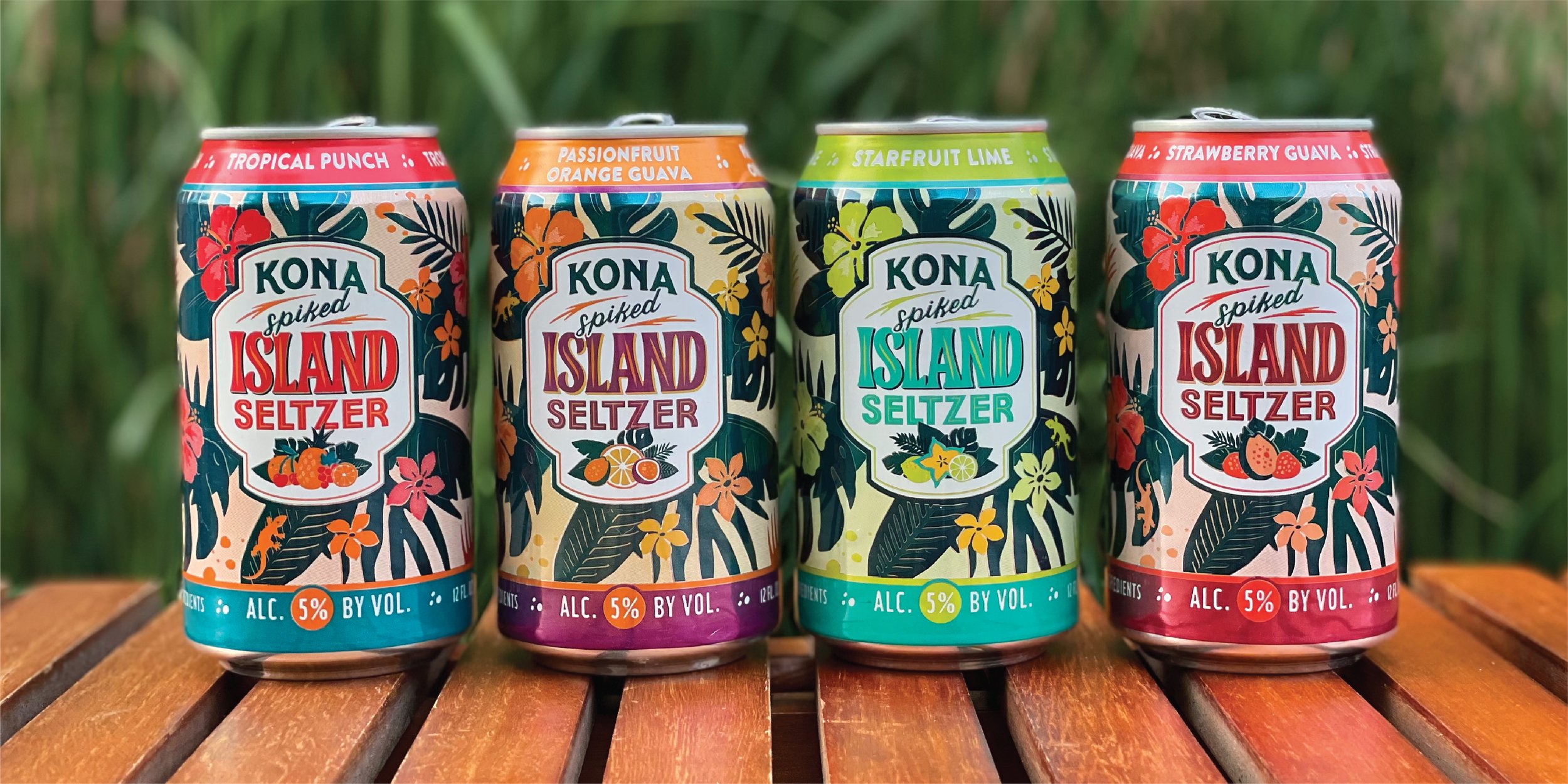
When our longtime client Kona Brewing Co. said they wanted to make a hard seltzer, White Claw and Truly had already established a strong design trend for this still-emerging category, dominated by white packaging and bold black typography.
I developed a bold and unique design program that didn’t fall prey to the trends, but rather kept the Kona brand and aesthetic at the center.
Sales in the first two years exceeded the brand team’s expectations, and it remains a strong component of their product portfolio.
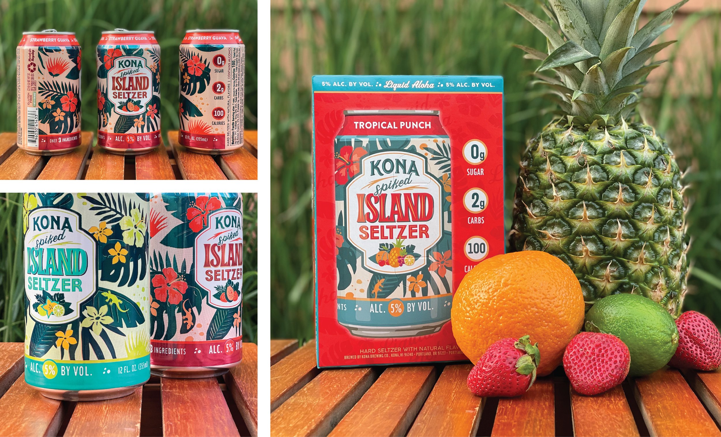
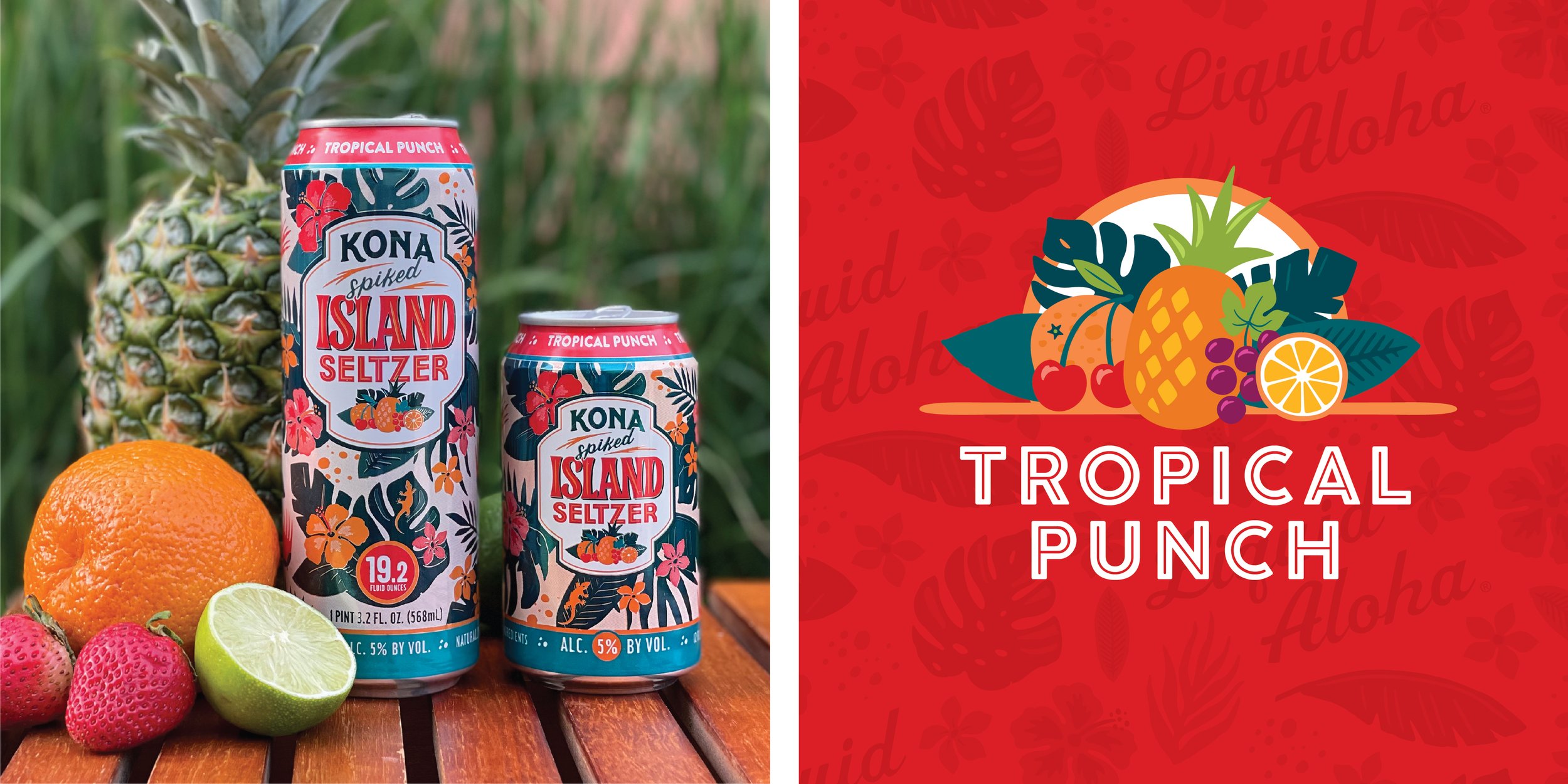
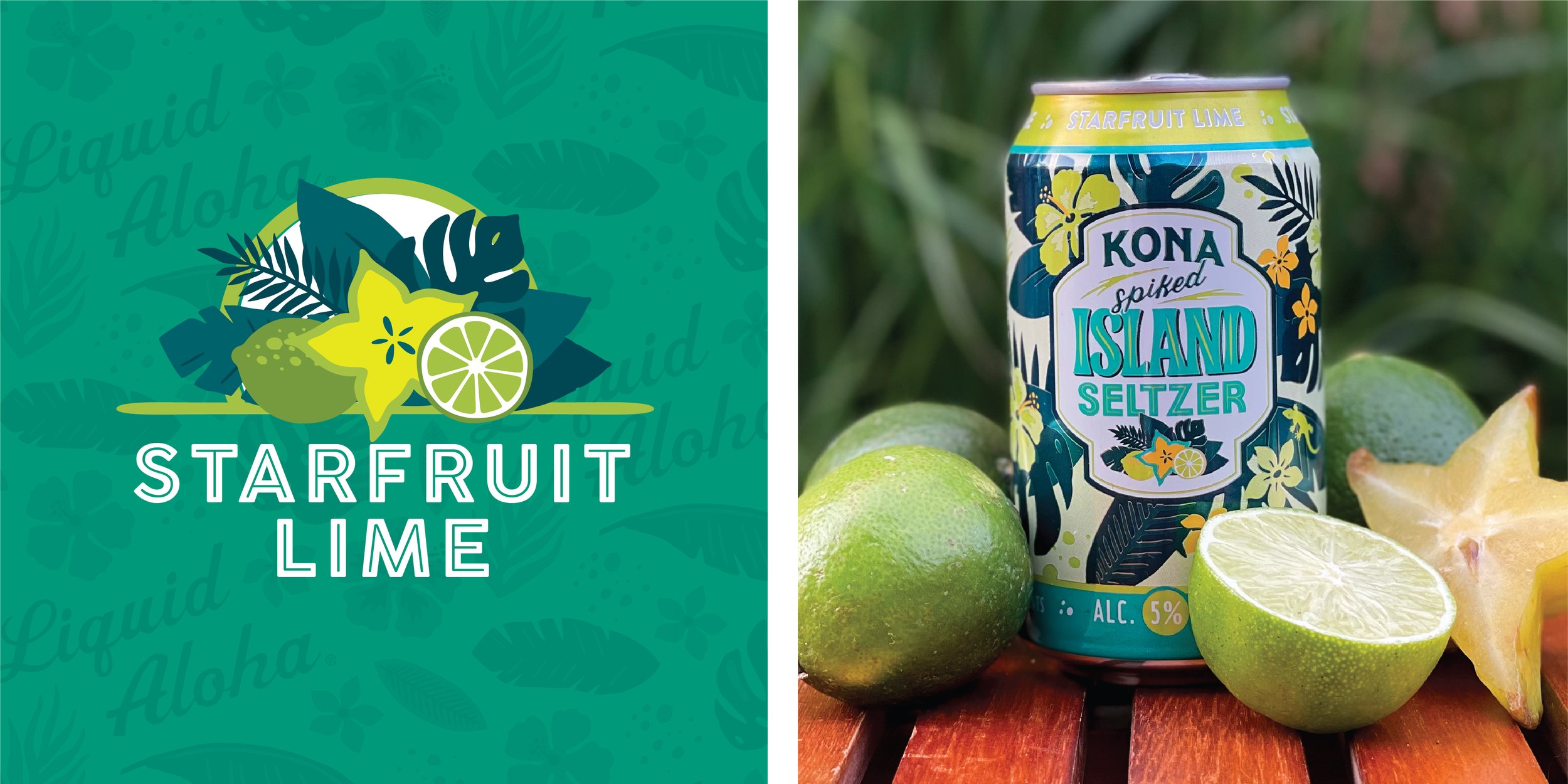
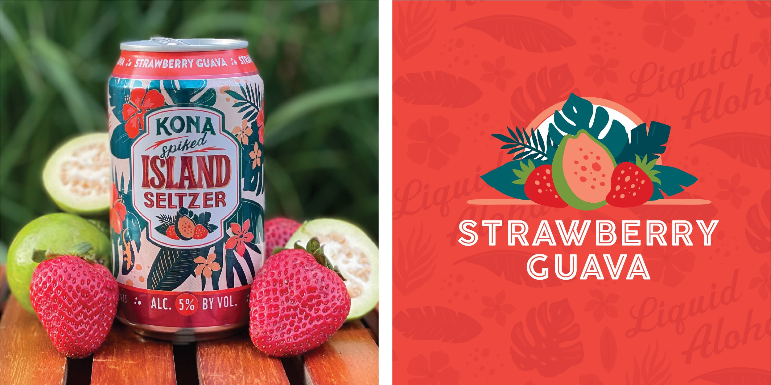
Capturing the colors and flavors of Hawaii, this package program fully embodies the brand’s “vacation in a can” ethos; play “Where’s Gary” the gecko while you enjoy each flavor
Vibrant colors, lush foliage and a vintage style are hallmarks of the Kona beer brand, which my team knew we wanted to carry through in these designs. But we also wanted to create a look that would uniquely appeal to seltzer drinkers.
I looked to Hawaii’s rich artistry traditions in Aloha Shirt patterns, and the funky typography of mid-century Tiki bar menus for inspiration.
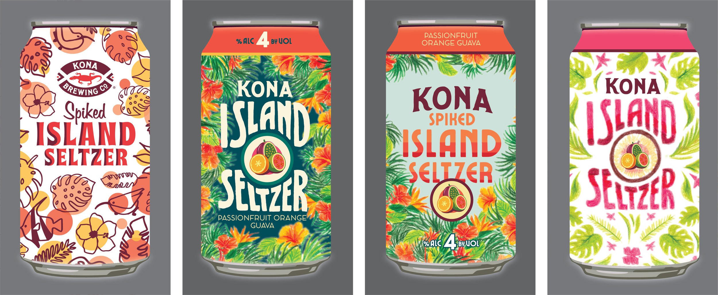
Some of my original concept sketches; © 2019 Flint Design Co.
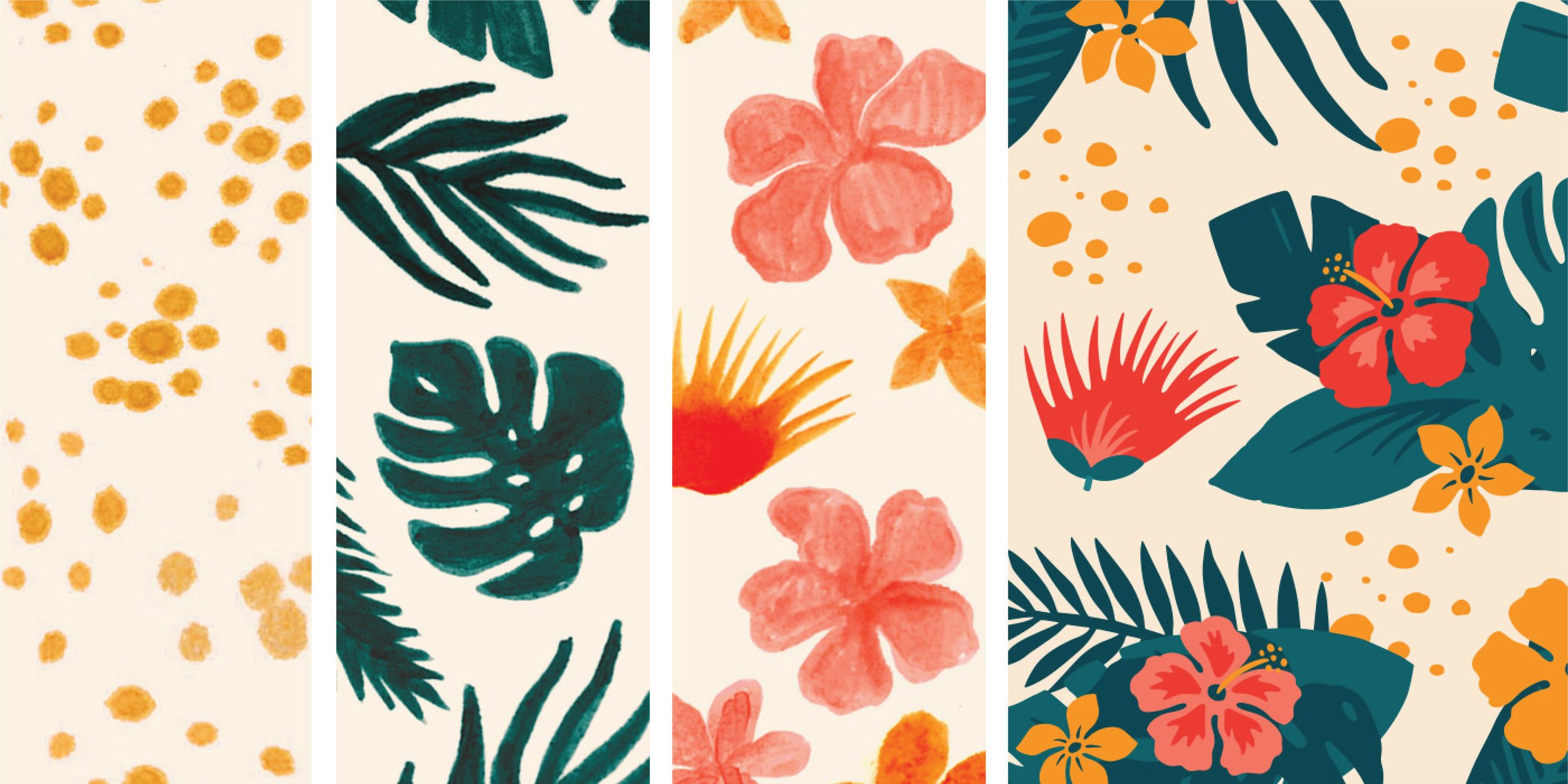
I drew all of the illustrations by hand and then digitized them to create a natural and lively, yet bold aesthetic
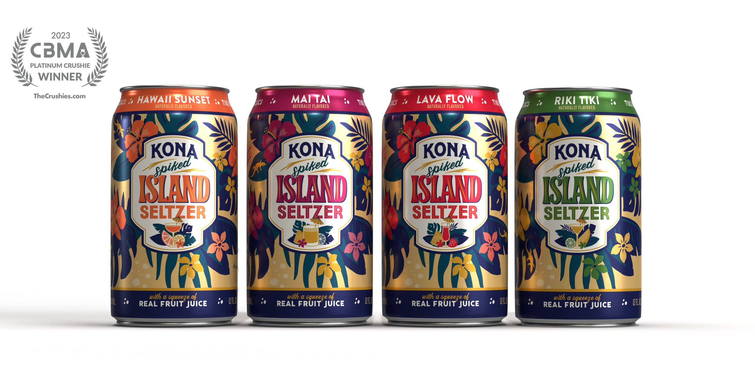
Concept work for a line of Tiki cocktail inspired flavors made with real fruit. ©Flint Design Co.

Orchids, a common cocktail garnish on the islands, replace hibiscus flowers in the background pattern. Cocktail glass illustrations and playful copywriting pay homage to vintage Tiki bar menus.
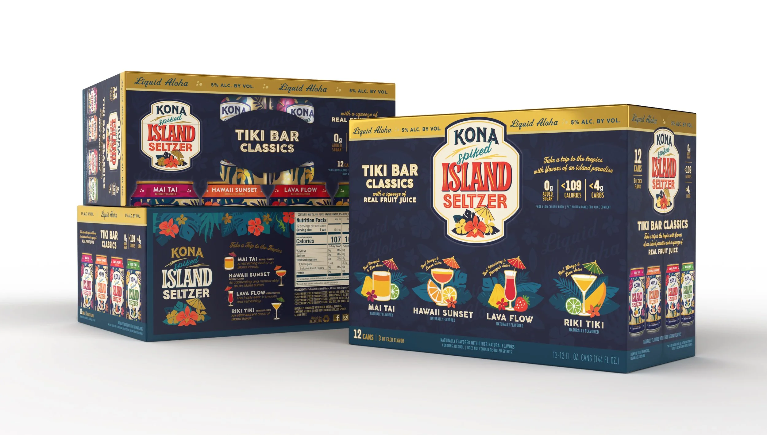
Metallic gold accents elevate this offering, creating a new occasion for consumers to buy Kona Spiked Island Seltzer.