Werner Gourmet Meats

THE CLIENT: Werner Gourmet Meats | THE TEAM: Flint Design Co.; Catherine Healy, Creative Director; Hogan Johnson, Development Director; Shannon Prichard, Sticks and Snacks Take-Down | THE PARTNERS: Jeff Foster, Illustration; IntroPDX, Copywriting | MY ROLE: Concept Generation, Lead Design, Illustration & Copywriting Art Direction, Design Direction, Print Production, Print Vendor Coordination
Portfolio Photography by John Valls Studio
As the beef jerky category was rapidly expanding in grocery stores, Werner Gourmet Meats saw an opportunity to share their tried-and-true family recipes with an audience beyond the convenience store. But their 25-year old brand was going to need an update.
I developed a new logo and design system that took inspiration from the family’s long history in making premium meat snacks, their home on the Oregon Coast, and their strong, irreverent spirit.
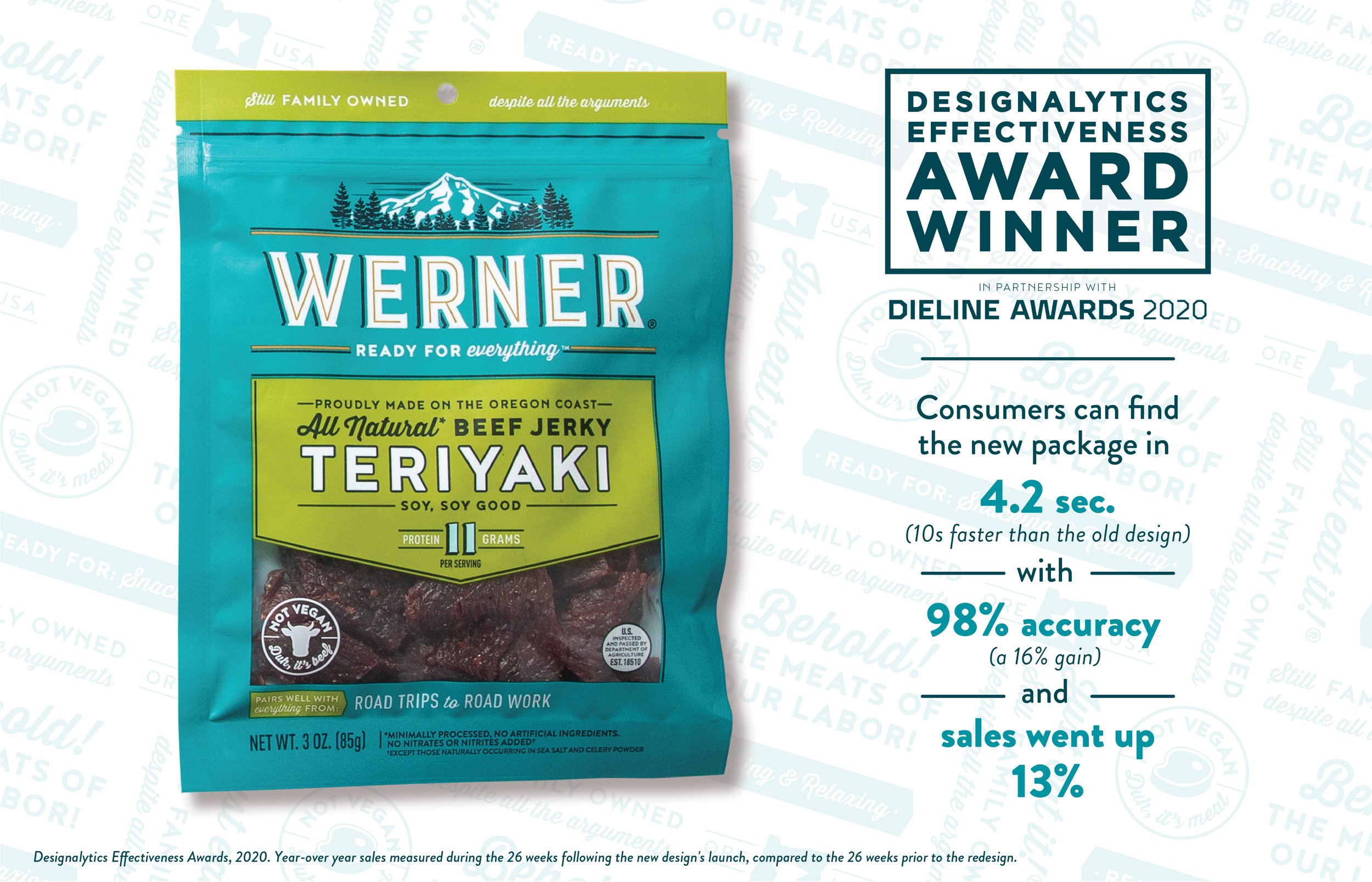
In the first year on store shelves, the brand saw increased visibility and likability, which translated to a 13% sales increase over the previous year.

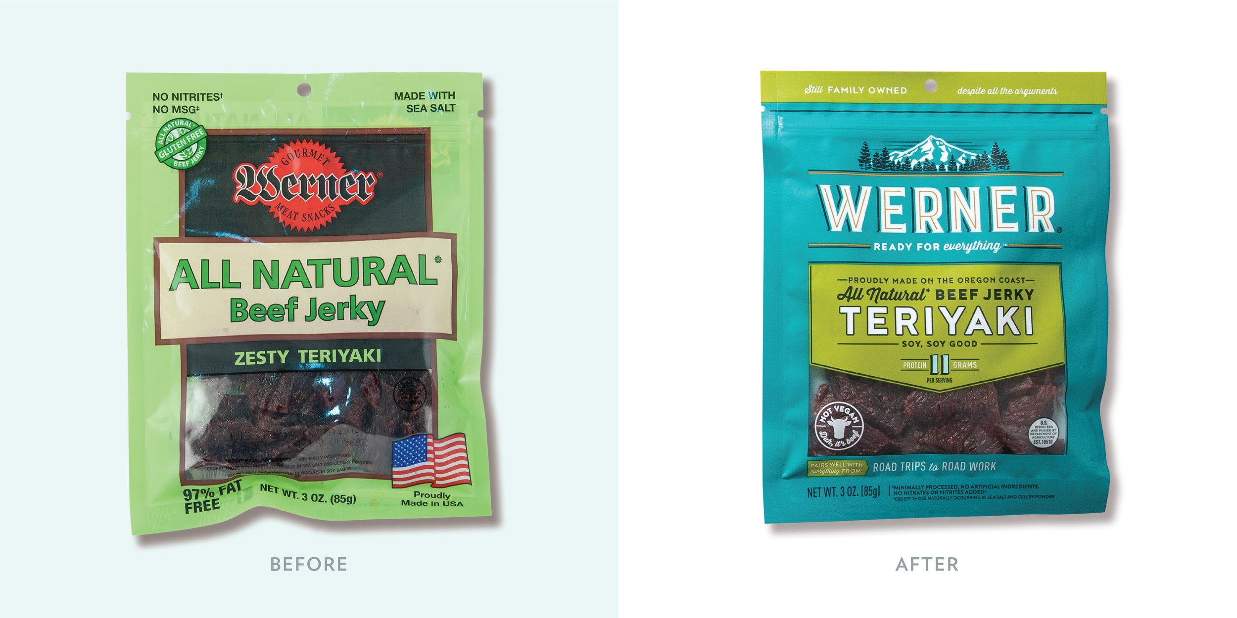
A consistent bright blue background and bold logo typography created stronger brand visibility on shelf – consumers could identify the brand on average in 4.2 seconds, down from nearly 15 seconds for the previous design.
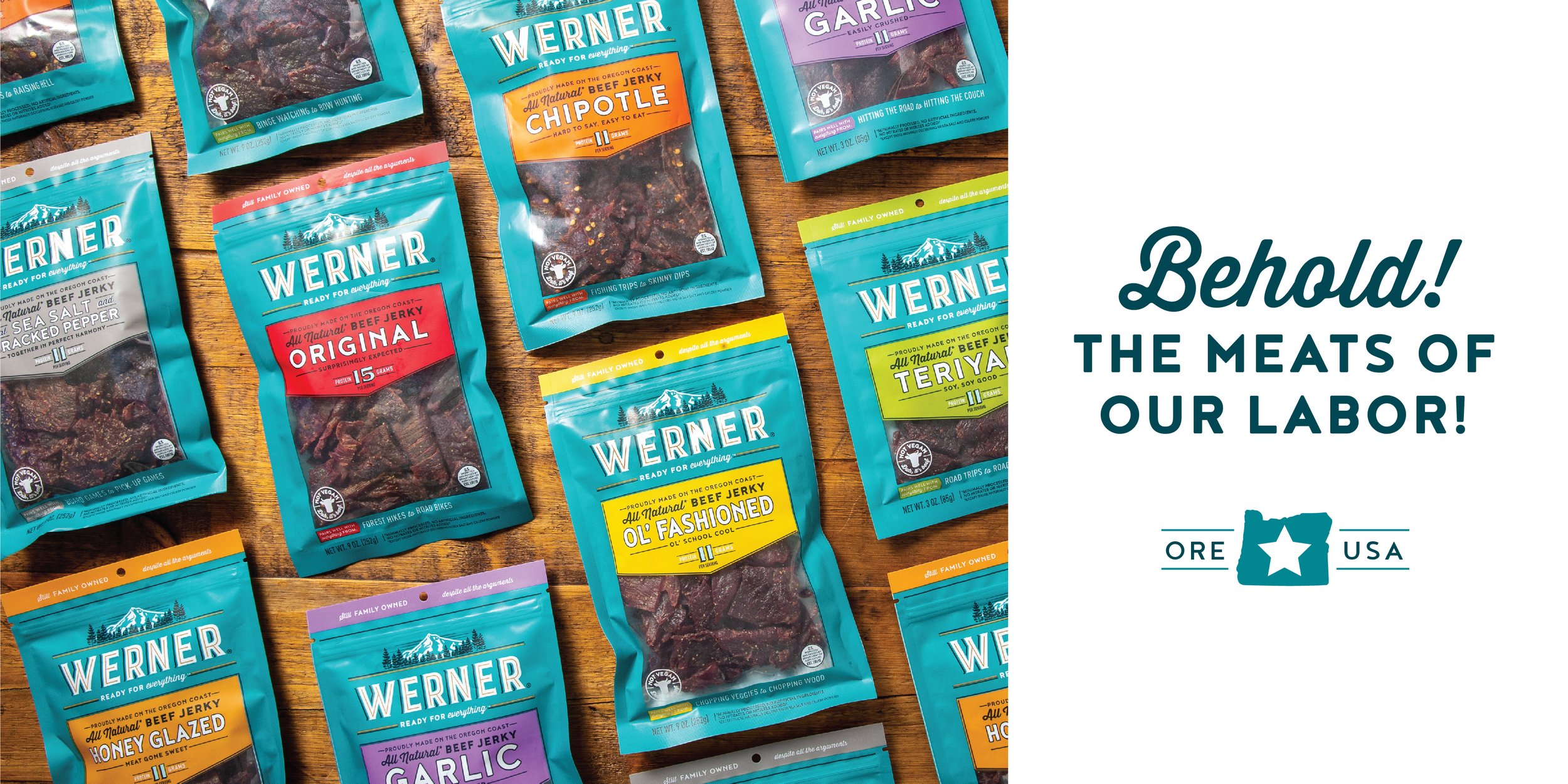
The Werner’s are anything but boring, and they wanted their packaging to reflect that. Clever copywriting and graphics celebrate the family’s irreverent attitude and witty sense of humor, and reflect the honesty and quality that goes into every one of their products.
Inspired by boutique butcher shops, I created a pattern from the key brand messaging. This was featured prominently on their Premium Meat Sticks and other meat snack packaging.

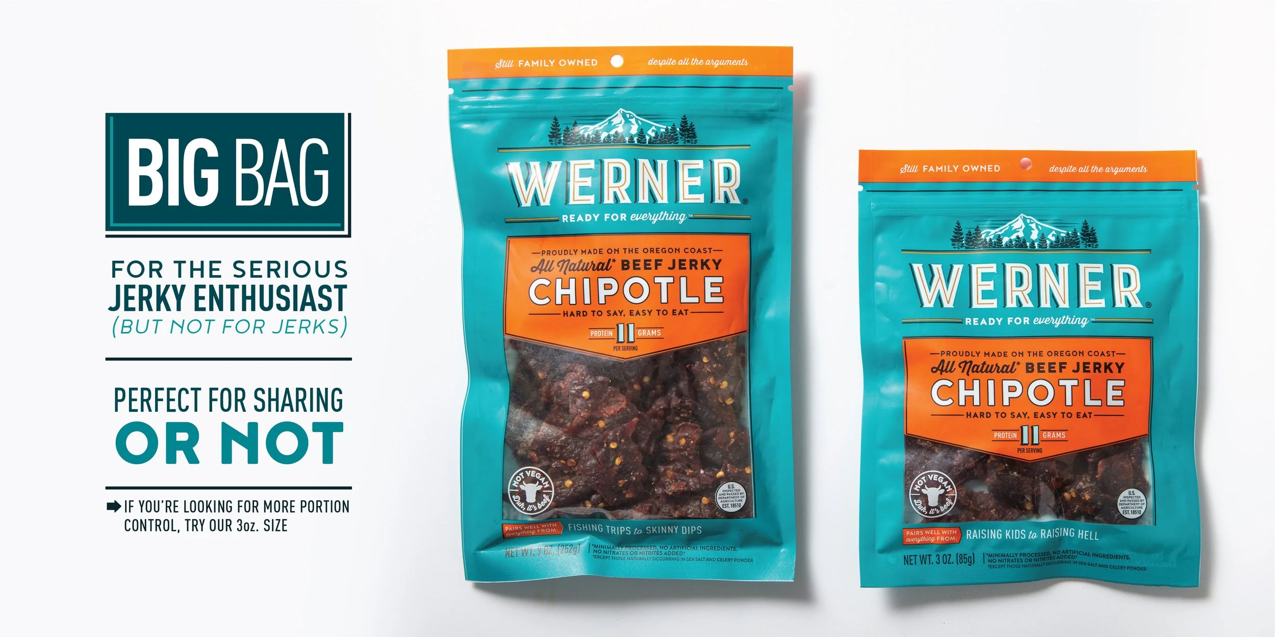
To reflect the family’s playfulness and sense of humor, quippy lines and graphics are featured throughout the packaging – an unexpectedly fun discovery for consumers. Most of the copywriting was developed by IntroPDX, but I wrote these gems while creating filler content for the larger bag layout.
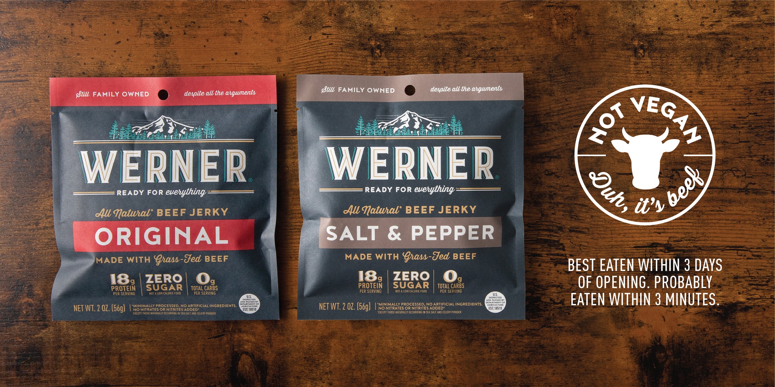
The design system needed to flex across four categories, including a new higher-end line of grass-fed beef jerky aimed at the growing Keto audience. We chose a kraft paper package for an immediately premium feel, and I selected a darker, but still bold color palette that would look luxurious and print well on the uncoated material.
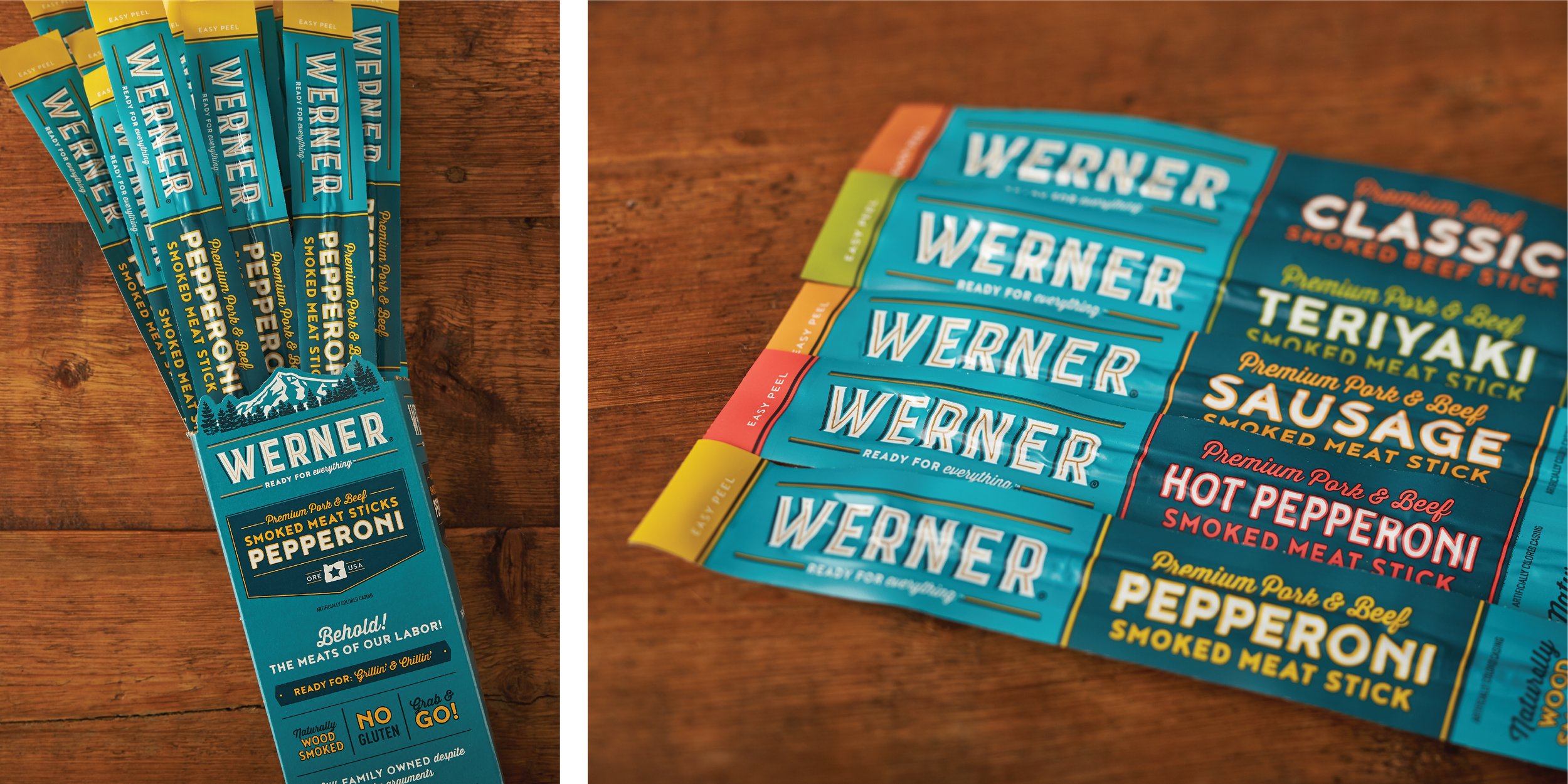
I included a die-cut around the logo on the display boxes for the meat sticks, accentuating the brand and bringing something unique to store shelves.
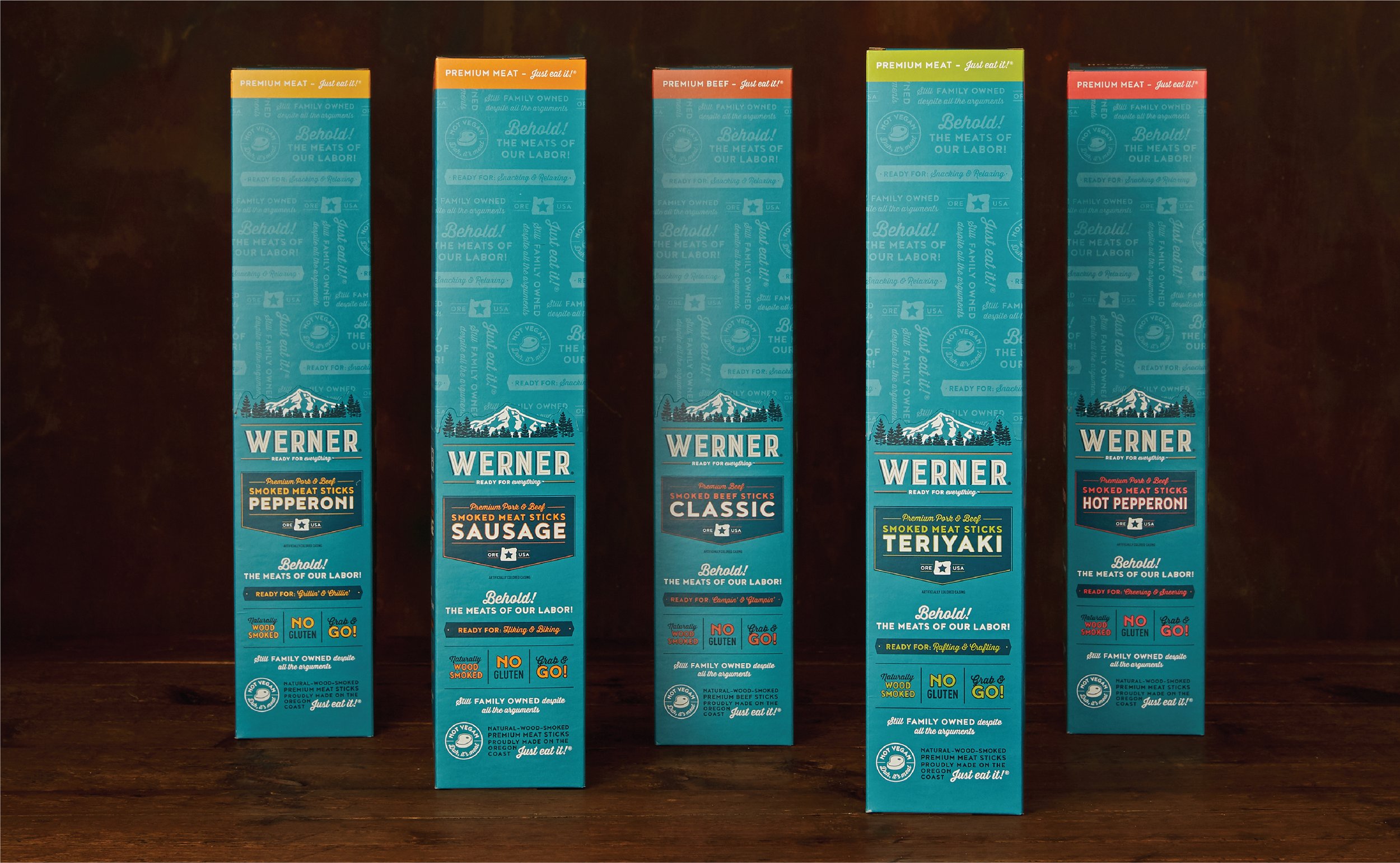
Waste not want not! Even the tear-away top of the display boxes for the meat sticks carried the brand’s personality and key messaging through a pattern inspired by boutique butcher paper wraps.
