Résonance Wines

THE CLIENT: Résonance Wines, Louis Jadot Estates | THE TEAM: Flint Design Co.; Catherine Healy, Creative Director; Hogan Johnson, Development Director; Kristen Burda, Design Muse | MY ROLE: Concept Generation, Lead Design, Print Production, Print Vendor Coordination
Portfolio Photography by John Valls Studio
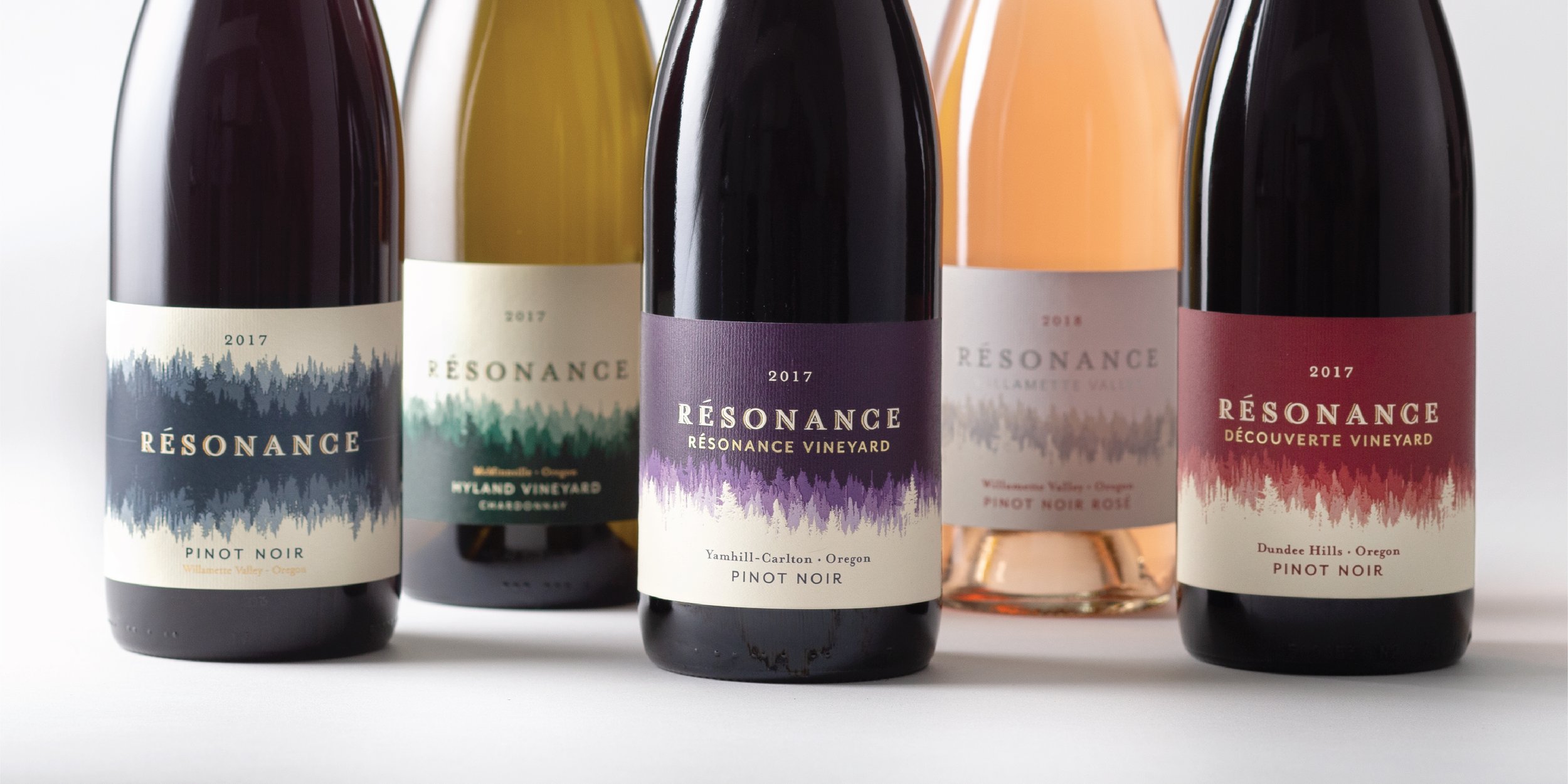
When the team at Maison Louis Jadot set their sights on starting a wine project outside France, they chose Oregon – not just because the state’s founding year is shared with their own, but because there is a spirit, a resonance, that emanates from the Earth. And when they discovered Resonance Vineyard, it was more than just the name that spoke to them. Exquisite wines and a deep sense of place immediately stirred their souls.
With the same meaning in French and English, Résonance Wines looks to express this deep connection between cultures, between old world and new, between place and people and wines.
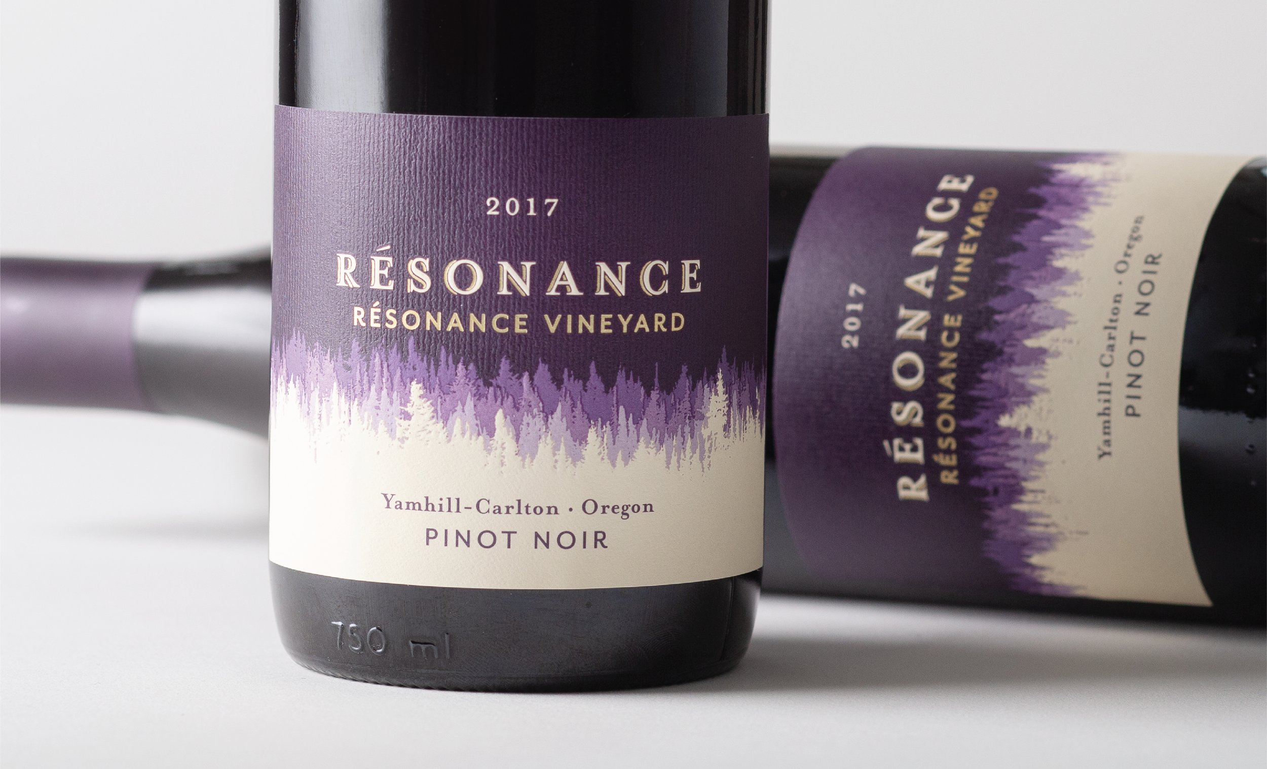
I worked closely with my fellow designer, Kristen Burda, to develop concepts for their single vineyard and regional blends. Exploring the visuals of sound waves and resonant energy, we found an intersection with the iconic scenery of Oregon’s Willamette Valley: row upon row of evergreen trees that fade into the distance. Using photos of actual trees that surround the vineyard, I created a design that represents the many layers of this brand, the seen and the unseen.
The flagship single vineyard and estate wines are distinguished by a layered tree line that fades into the distant sky. A multi-level emboss creates physical depth, while an ombre of rich jewel-tones – unique to each vineyard’s AVA and terroir – mimic visual depth. A vertical texture emboss creates yet another layer, and represents the rains that are synonymous with the Northwest.
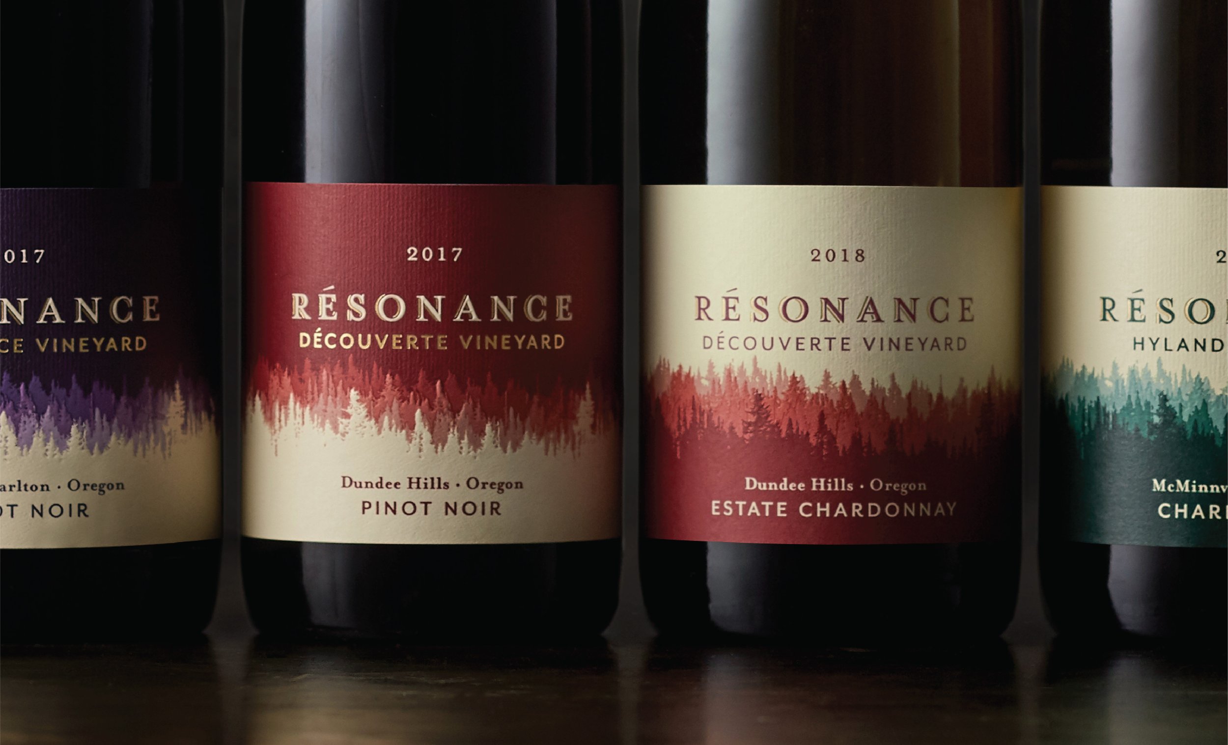
A simple reverse of the color flood quickly distinguishes red wines from white.
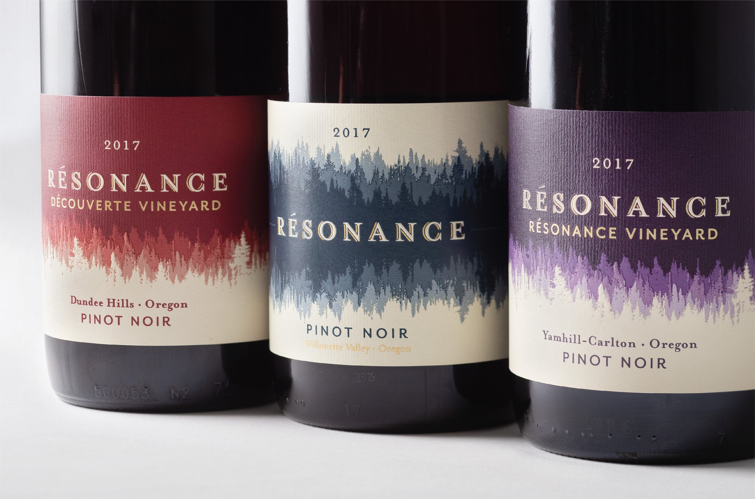
The Willamette Valley blends are marked by a different expression of trees and sound: a reflected tree line in a neutral blue reminiscent of foggy mornings and winter skies.
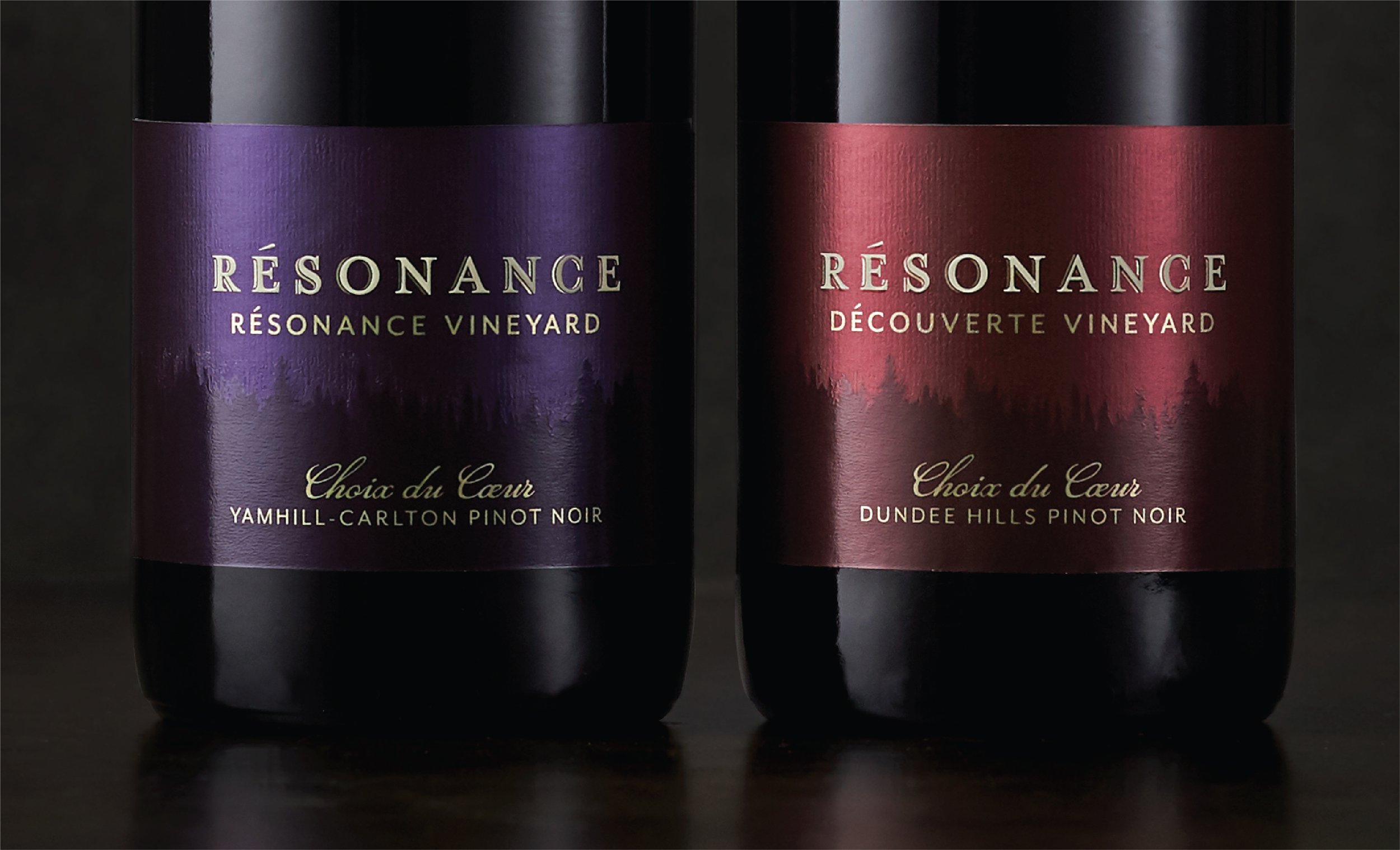
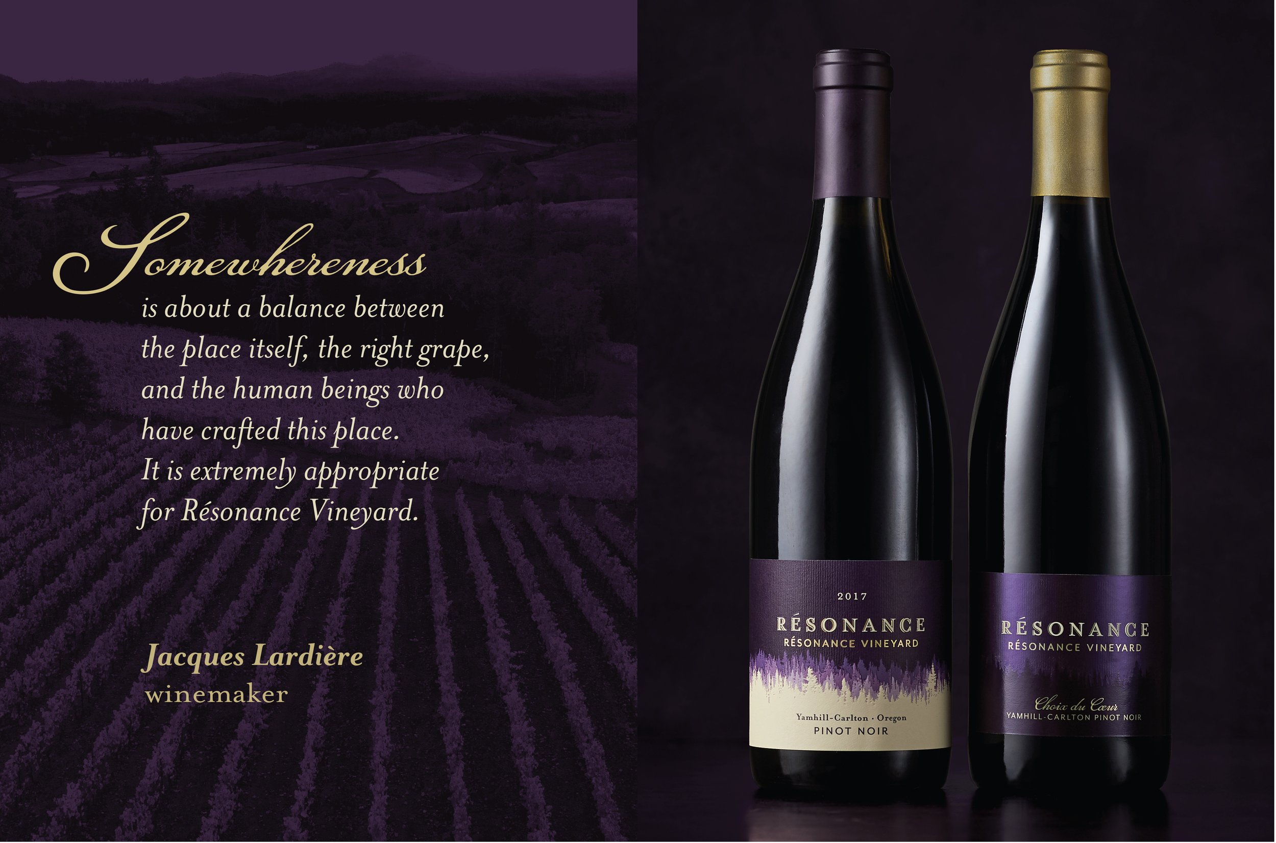
Their special estate selections – Choix du Coeur or the winemaker’s “Choice of the Heart” – needed to convey a more premium wine experience from the same vineyards. I chose to maintain specific design elements of the single vineyard tier to create a cohesive system, including the vineyard-specific hues. I elevated the designs by simplifying to a deep tone-on-tone color palette, a single tree line barely silhouetted against a night sky. A metallic label with a mix of varnishes reflects light in an unexpected and enchanting way.
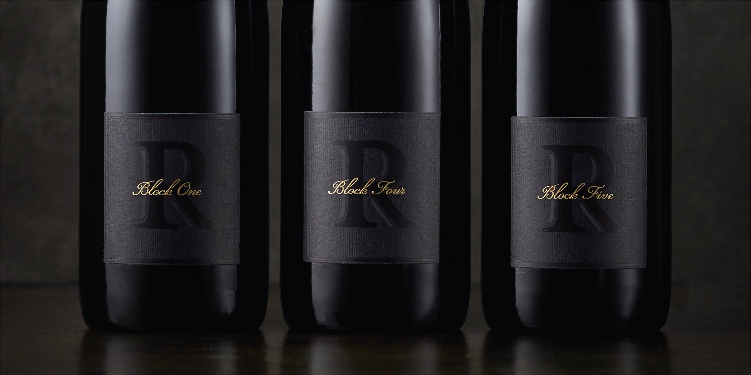
Their block selections needed to convey yet another, and even more special experience. Each of these wines represents a single block and single clonal variety; they are the purest expression of the vineyard, the elemental building blocks of their winemaking. Working closely with my design colleague again, we came up with an elegant design concept yet again inspired by science: the periodic table. As a solely direct-to-consumer product experienced in the tasting room, these labels could be more mysterious in their expression of the brand. Subtle tone-on-tone graphics enhanced by different varnishes and a vertical texture emboss simultaneously set this label apart and connect it to the rest of the brand.
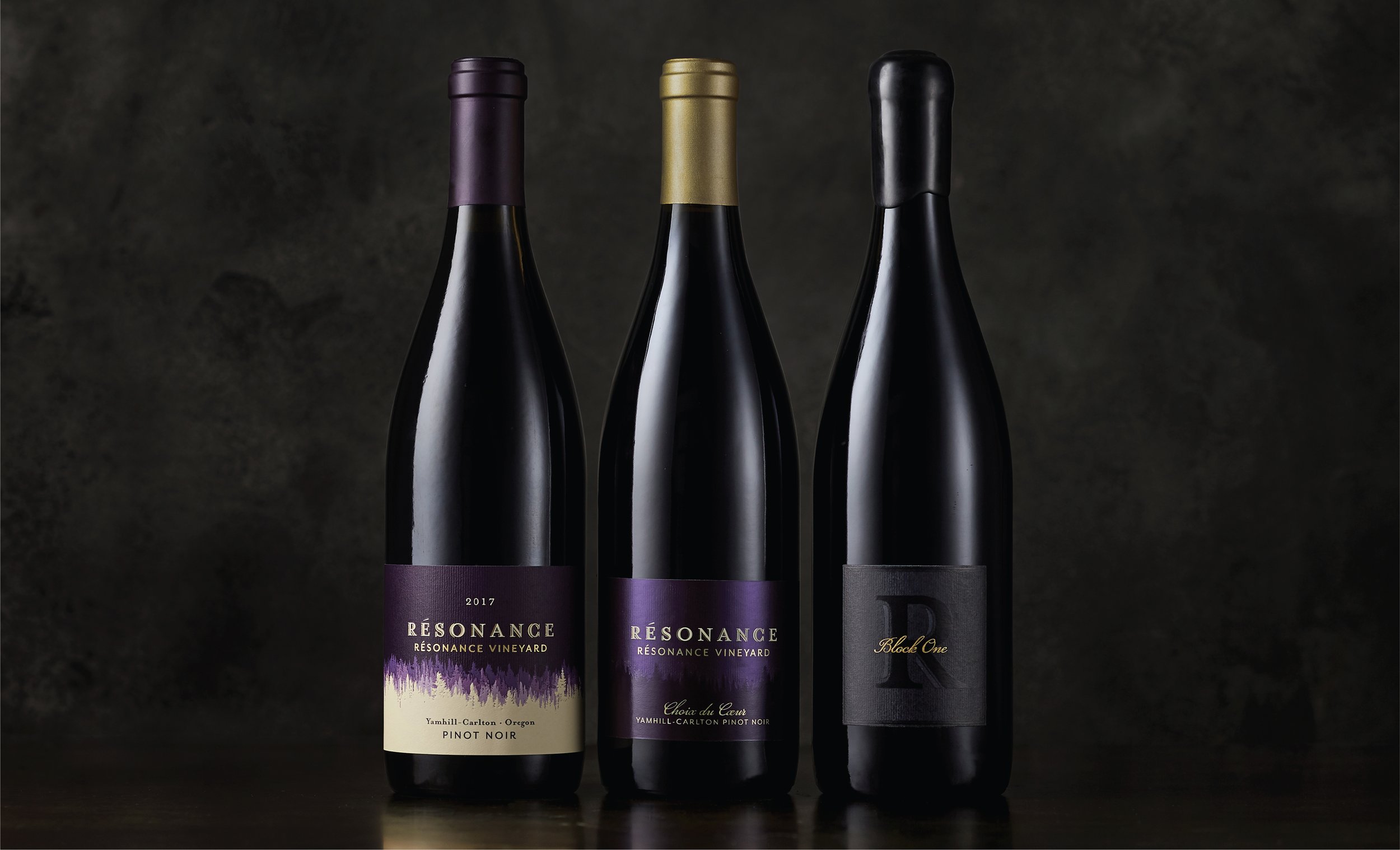
The full Résonance Vineyard portfolio, representing the three tiers of quality and price.
Social media content I created to promote these projects and brand work for Flint.