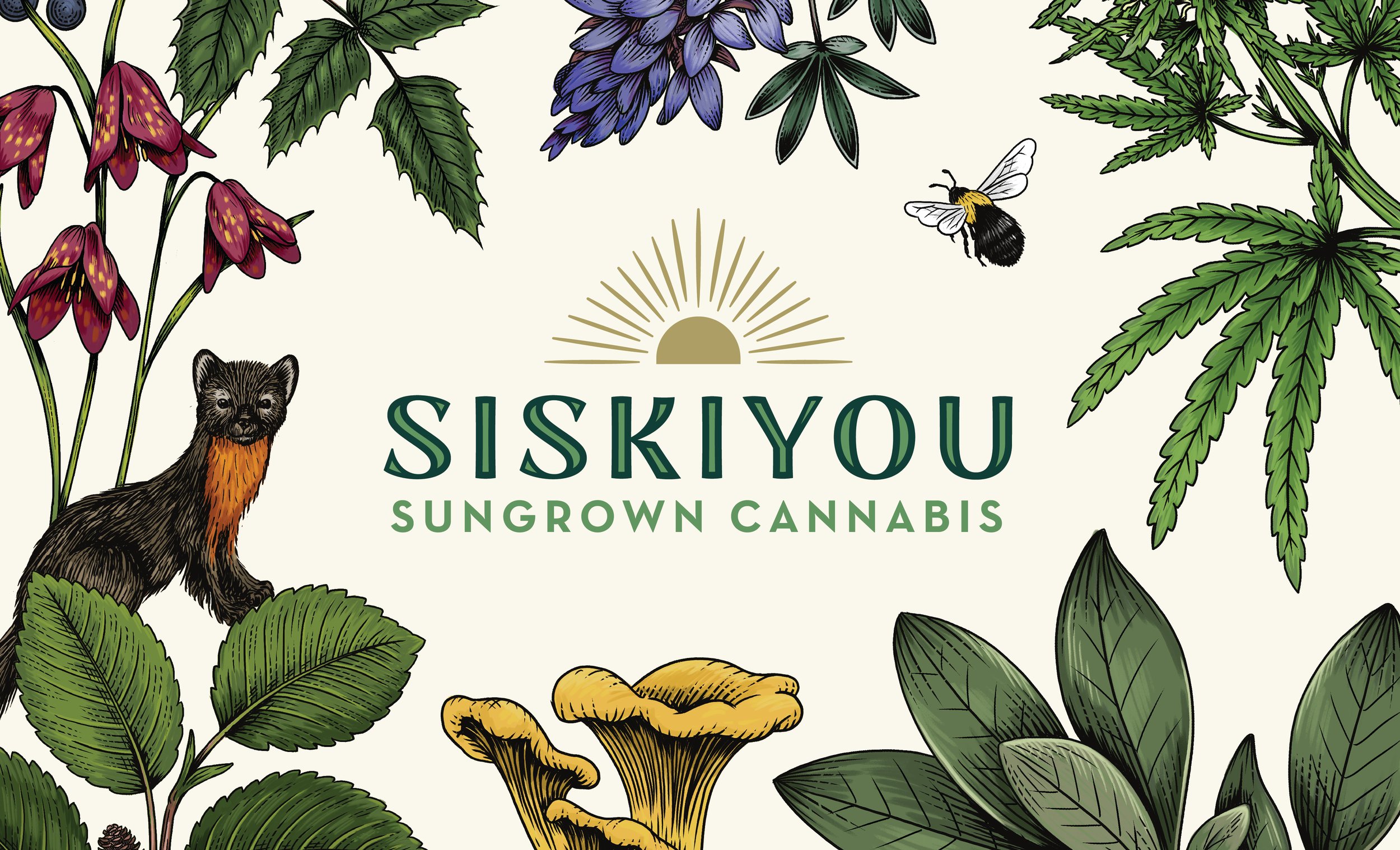
Siskiyou Sungrown Cannabis

THE CLIENT: Siskiyou Sungrown Cannabis | THE TEAM: Flint Design Co.; Catherine Healy, Creative Director; Hogan Johnson, Development Director; Shannon Prichard, Supporting Designer | THE PARTNERS: Charlotte Day, Illustration | MY ROLE: Concept Generation, Lead Design, Illustration Art Direction, 3D Renderings
A small, family-owned operation in Southern Oregon, Siskiyou Sungrown was in need of a new logo and packaging design that reflected the level of care and quality that they put into their tinctures and oils.
I created a new master design system that communicates clearly and effortlessly to their core consumers – people in pain – and can be easily applied across their range of products by their in-house team.
Unfortunately, they suffered devastating crop losses and we were unable to carry this through to completion. This shows my master concept in its intended application across their tincture line.

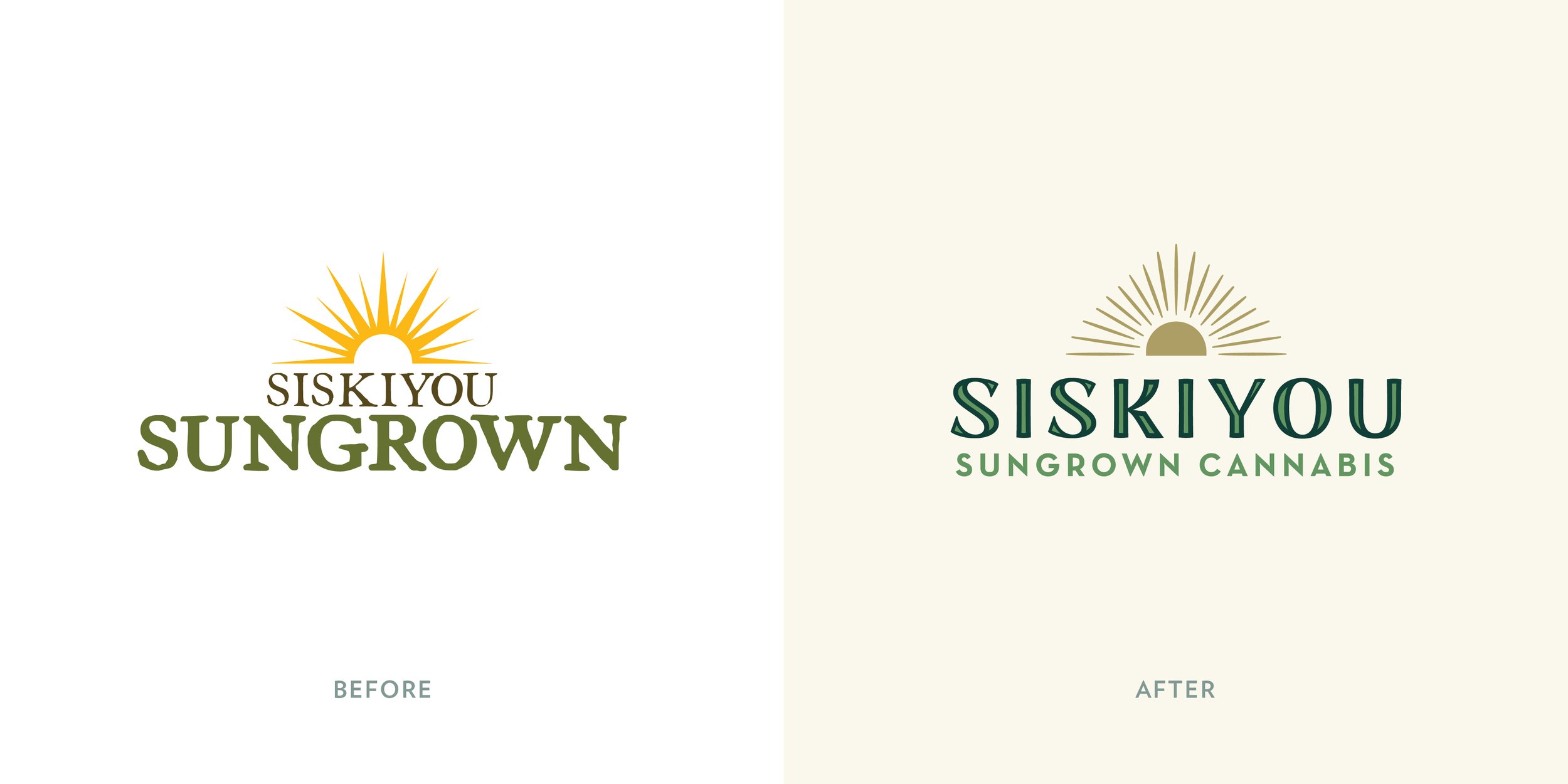
A new emphasis on the word “Siskiyou” was the first step to differentiate them in an increasingly crowded market, and bring attention to their unique place story.
My colleague, Shannon Prichard and I worked closely to develop the new sun mark, which captures the sense of radiance and enchantment that their products embody.
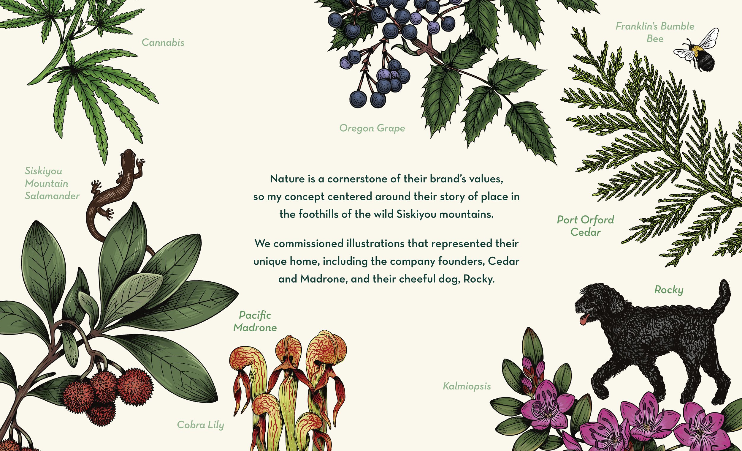
I researched this unique region and guided the illustrator to ensure we were bringing their story to life as authentically as possible.
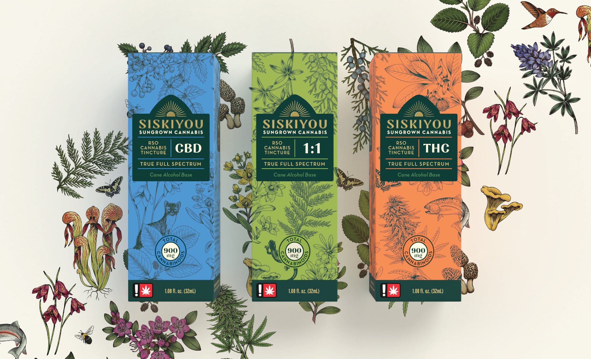
Full-wrap illustrations line up across the face panels of the three products, creating a strong and seamless billboard for the brand on shelf.
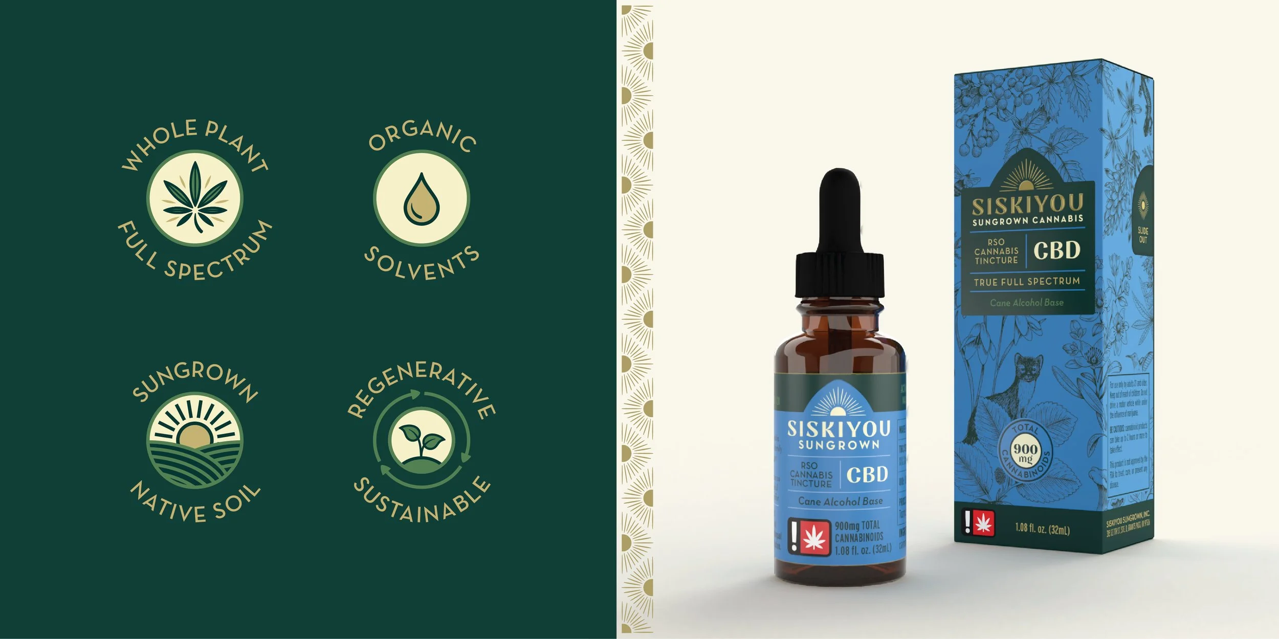
I illustrated a set of icons that quickly communicate the company’s key selling points on packaging, website, and beyond.