Square Mile Cider Co.

THE CLIENT: Square Mile Cider Co., Craft Brew Alliance | THE TEAM: Flint Design Co.; Catherine Healy, Creative Director | THE PARTNERS: IntroPDX, Copywriting | MY ROLE: Concept Generation, Lead Design, Tag Line Writing, Copywriting Art Direction, Print Production, Print Vendor Coordination
Portfolio Photography by John Valls Studio

In the 1850s, one square mile of land was granted to any married couple who ventured West and settled in the Oregon Territory. This was the beginning of “Oregon Fever” and the pioneering spirit that still defines the Pacific Northwest today. With that same ambitious spirit, and fruit that can trace its roots back to those original farms, Square Mile Cider Co set out to carve their own path and raise the bar for American ciders.
I dug through Oregon’s deep history of settlers, farmers, and explorers for inspiration. Our still-wild wilderness seemed a natural place to anchor this brand that champions trailblazing and discovering your own way. The rich graphic lexicon of our national and state park signage struck the perfect balance of nostalgic and adventurous, natural and engineered.
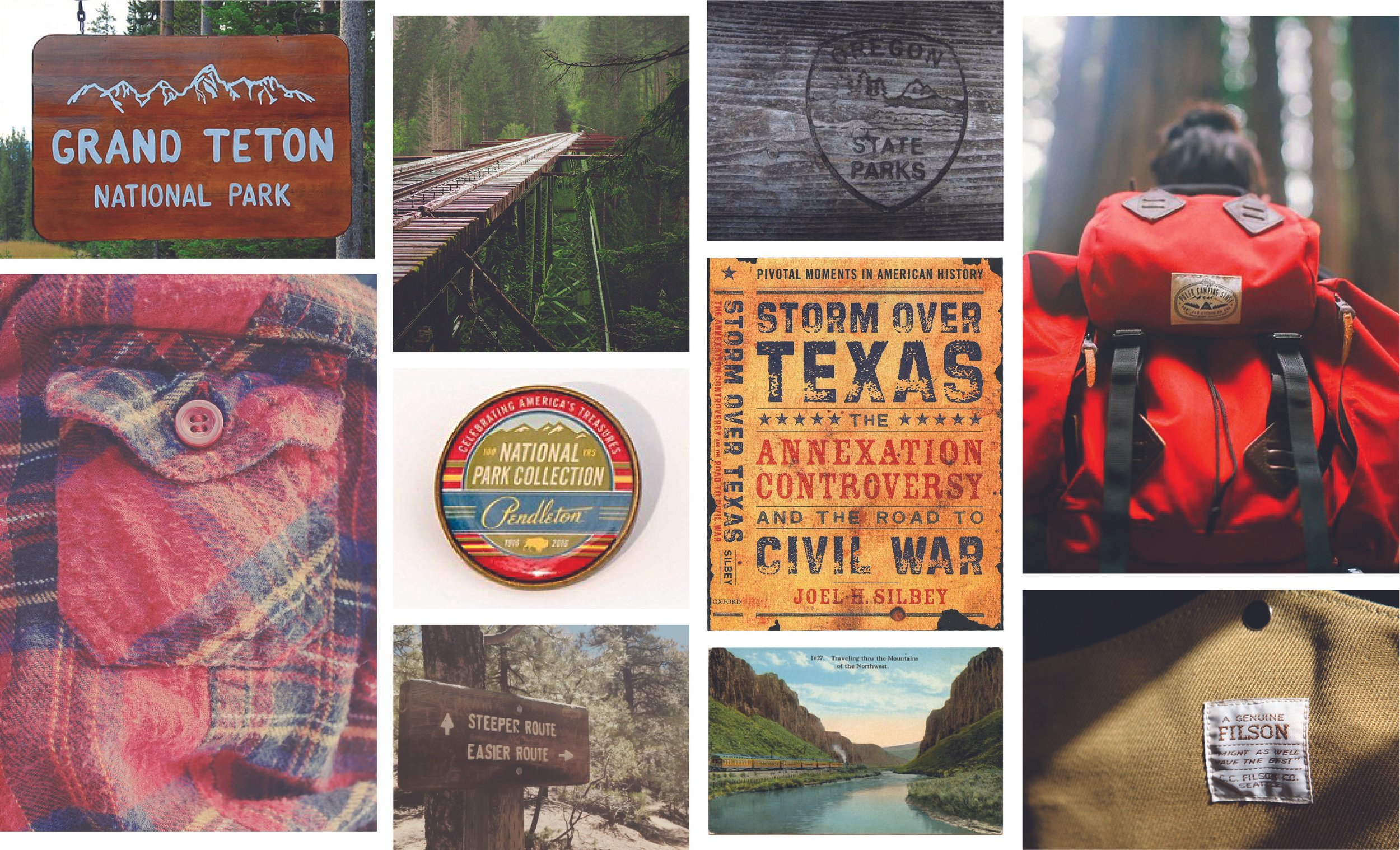
Inspiration came from a variety of sources, including signage, camping gear, Northwest outdoor brands, old maps, fruit crates, and vintage postcards, among other things.
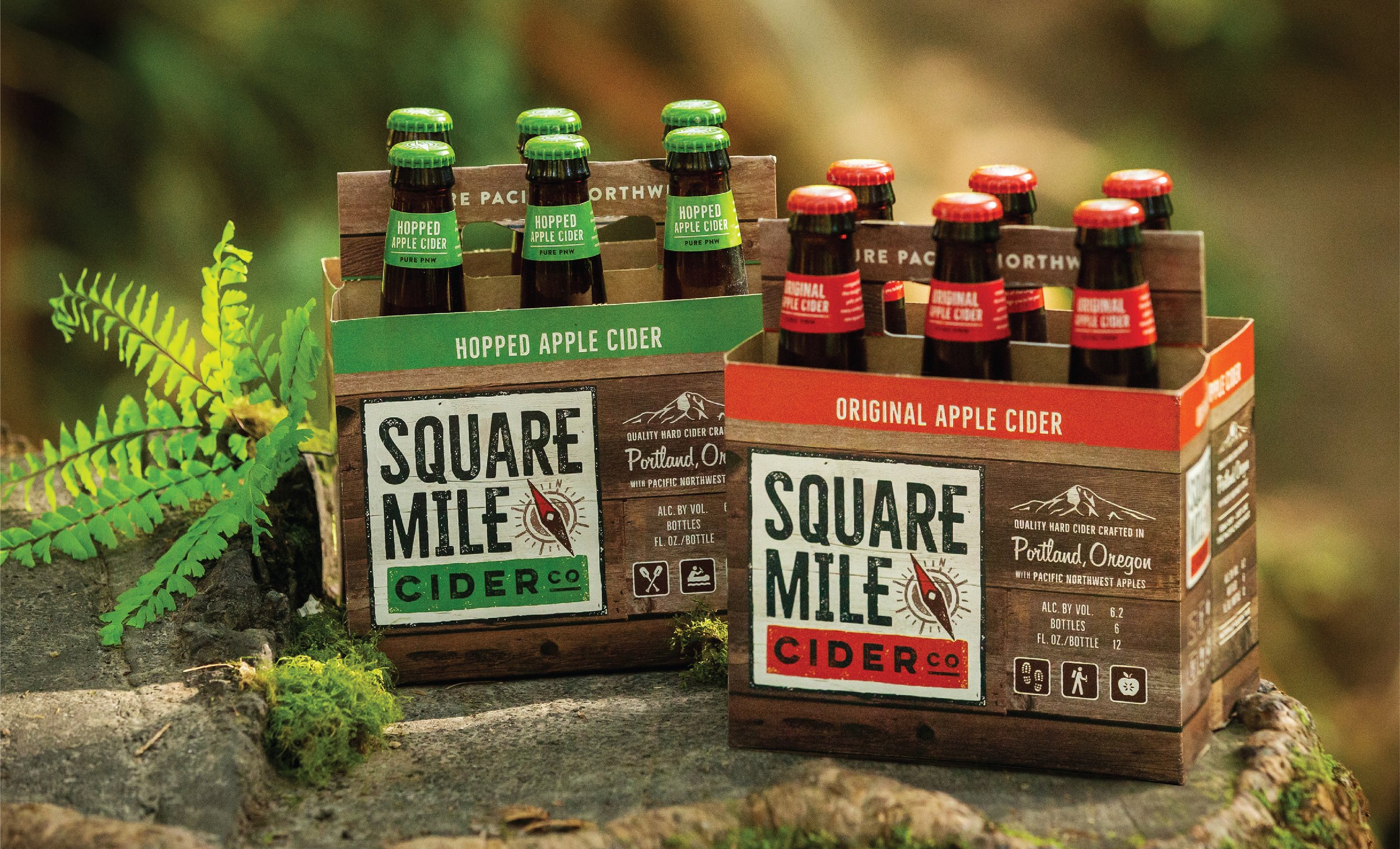
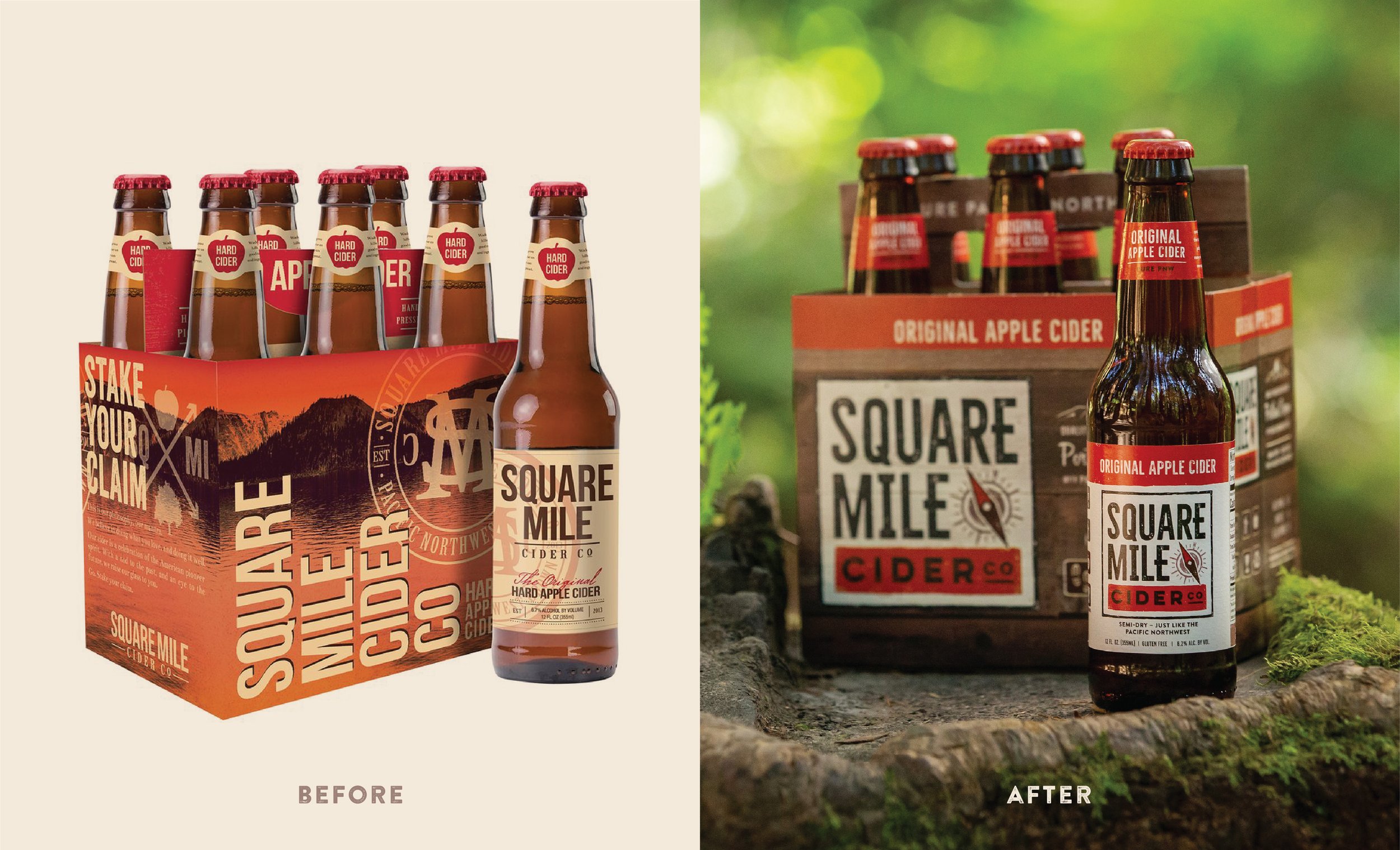
Reminiscent of a worn, carved trail sign, the packaging boasts bold colors and an icon system that quickly defines each cider in their line-up. The logo shape and geometric lettering reinforces the name, and the compass speaks to both the brand’s home in the PNW and its ethos of getting “off the easy path that lies straight ahead and wandering the winding trails of other like-minded adventurers.”
After crafting clever taglines to support each of the flagship products, I worked with IntroPDX to deepen the brand's storytelling and connect with consumers on an emotional level. When my team and I were done with it, Square Mile Cider Co. was the quintessential cider brand of the Northwest.
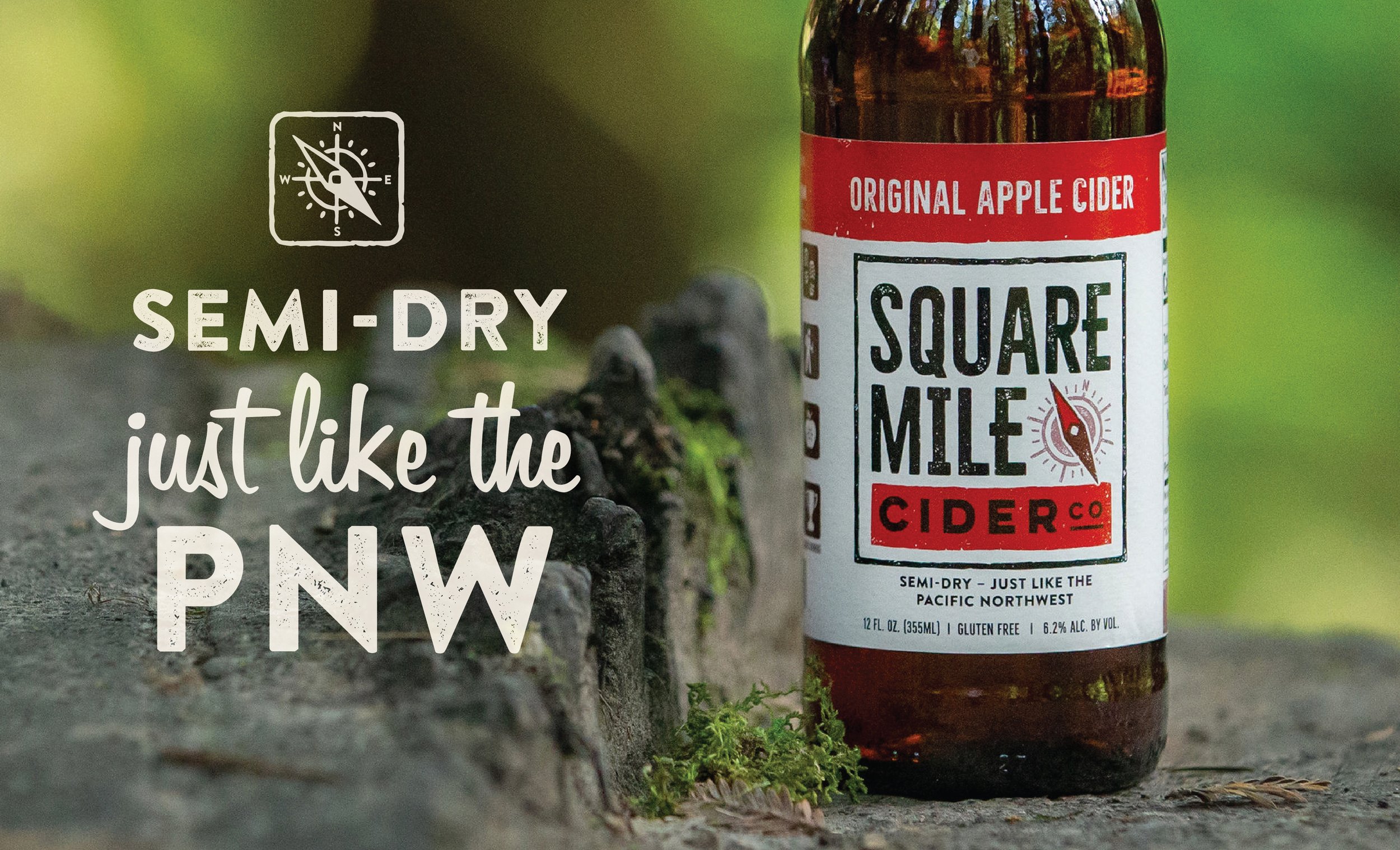
I wrote punny tag lines for each of their core flavors.
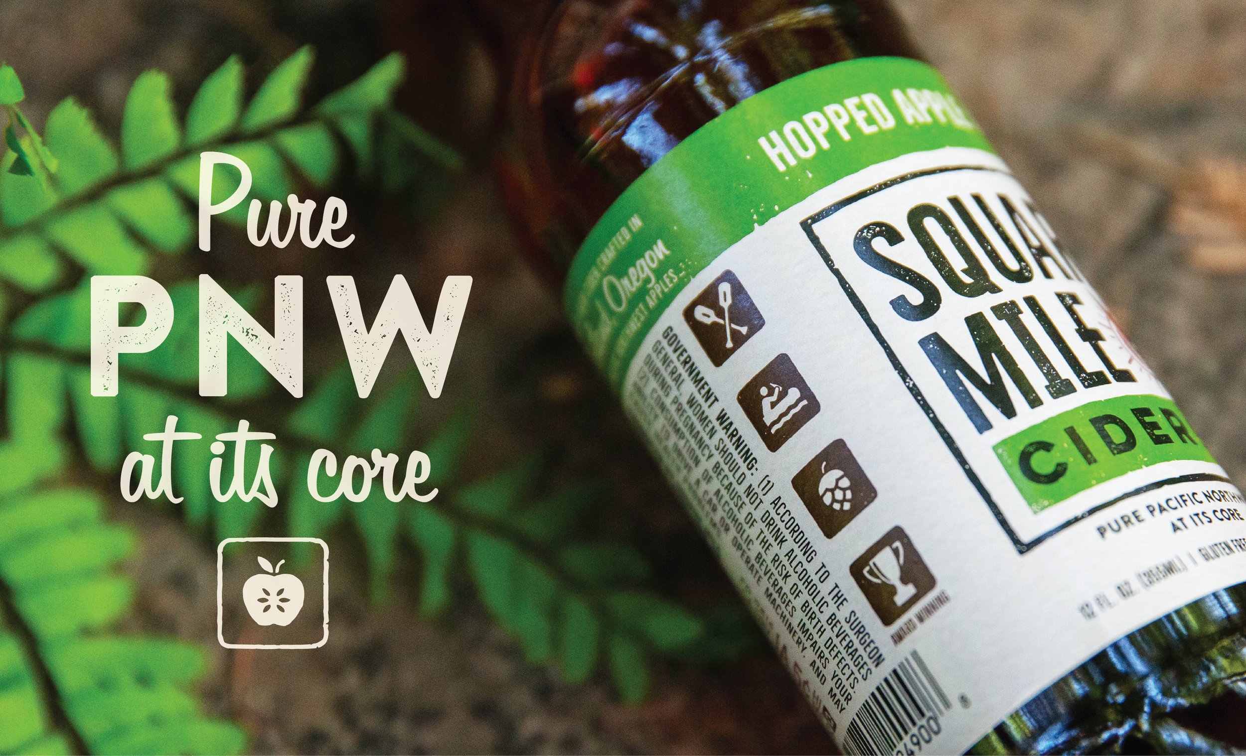
I developed an icon system inspired by outdoor recreational signs.
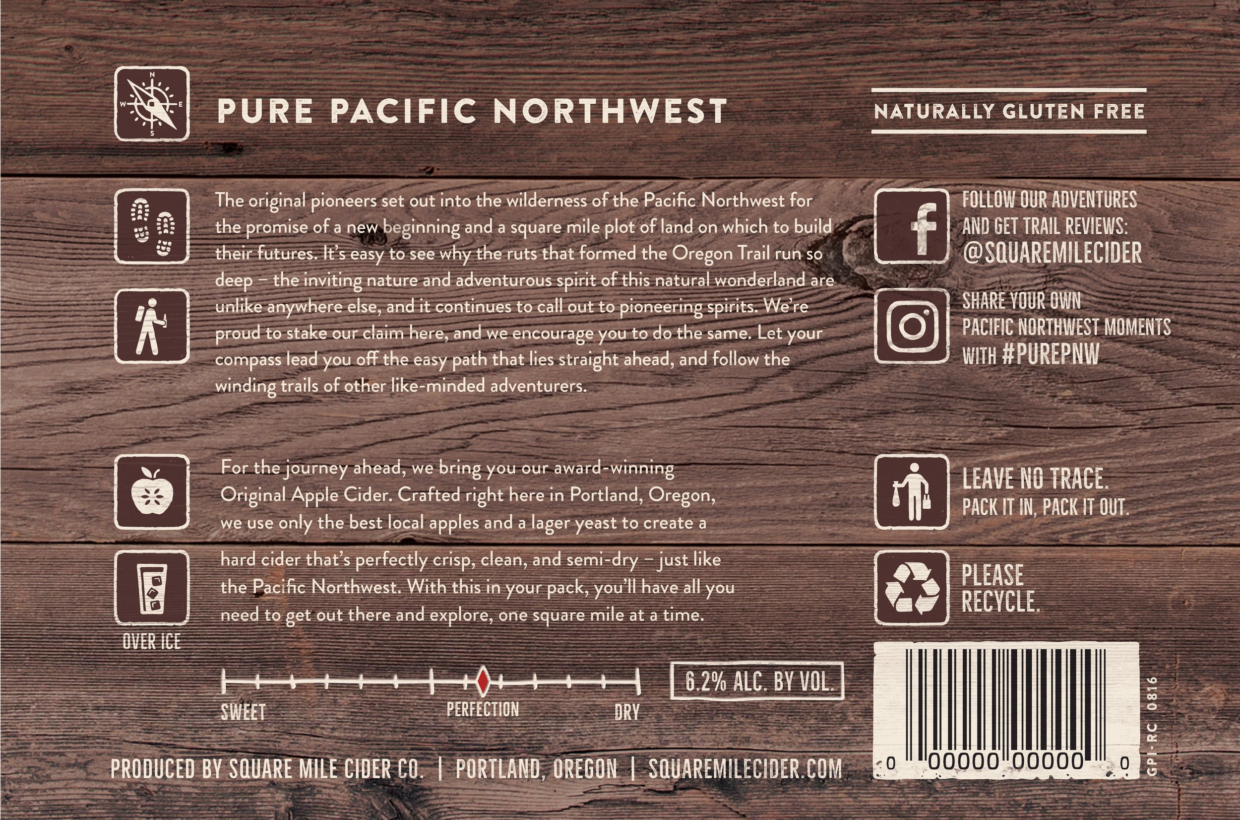
Leaning into the brand my team and I had created, I found enjoyable ways to display otherwise uninspiring legal and technical information, such as alcohol content, recycling info, and serving suggestions on the bottom of the 6-pack.
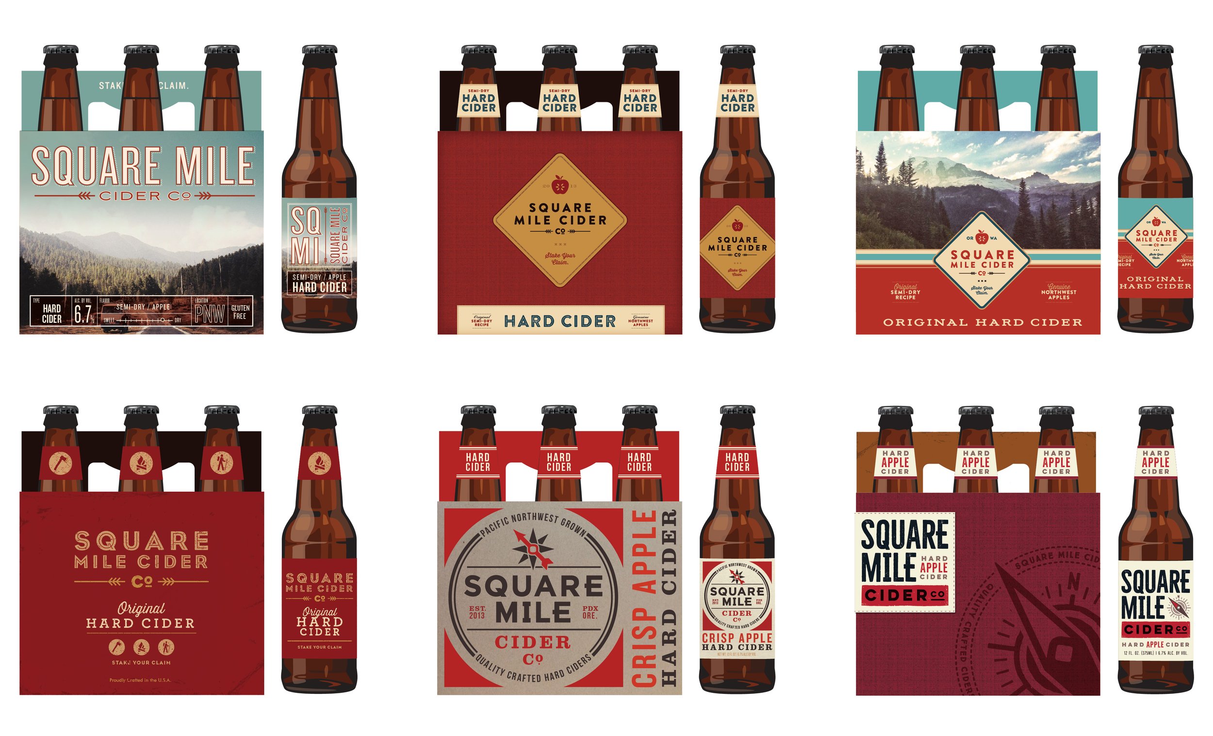
In my concept work, I explored a wide variety of ways to bring our inspiration to life. ©2015 Flint Design Co.
